Welcome to Part 1 of a three-part series on website navigation—where we tackle the mistakes that quietly kill engagement, credibility, and conversions.
Your Website’s Silent Dealbreaker
Most website owners obsess over aesthetics, content, and branding—but navigation? That’s just a menu, right? Wrong.
Your navigation is the invisible force shaping visitor behavior. Get it wrong, and people won’t just feel lost—they’ll leave.
Some mistakes are obvious—broken links, cluttered menus. Others are sneakier, like overwhelming users with too many choices, hiding essential pages, or making mobile navigation an afterthought.
So, how do you avoid these traps and build a site that keeps visitors moving where you want them to go?
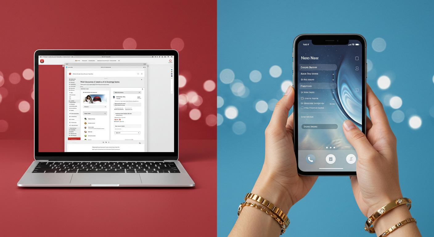
Understanding Navigation Types
Different websites need different navigation styles. Before blindly choosing a menu setup, consider what works for your site and audience.
- Top Horizontal Menu – Clean, familiar, great for business sites and e-commerce.
- Dropdown Menus – Useful for content-heavy sites but must be simple and clear.
- Sidebar Navigation – Best for blogs and dashboards, helps structure large content sections.
- Sticky Navigation – Keeps core actions visible as users scroll—great for conversion-focused pages.
- Hamburger Menu – Mobile-friendly but often hides important links from users who aren’t hunting for them.
What Should Go in Your Menu?
Clients often defer to the designer when choosing their site’s navigation, missing an opportunity to create a menu that actively supports their visitors’ experience and engagement. Instead of defaulting to a basic structure, guide your designer towards navigation that enhances usability and keeps your site visitors moving through your site seamlessly.
A strong menu balances clarity and engagement. These are the standard links most sites need:
- Home – Even if branding makes it subtle, users expect an easy way back.
- About – Builds trust with visitors, showcasing the brand’s mission and credibility.
- Services/Products – Direct access to what the business offers.
- Portfolio/Case Studies – Essential for companies selling expertise.
- Testimonials/Reviews – Reinforces trust and social proof.
- Contact – No one should have to hunt for this, make it obvious.
- Blog/Resources – If content marketing matters, give it a prime spot.
Choosing the Right Navigation for Your Site
Don’t settle for default choices—help clients define navigation that supports their site’s goals. Ask them:
✔What’s the primary purpose? Sales, engagement, credibility?
✔How complex is the content? Simple vs. multi-layered structure?
✔Who are the visitors? Tech-savvy users vs. casual browsers?
✔How will they browse? Desktop vs. mobile-first design?
Your menu isn’t just for looks—it’s a strategic tool for directing action.
Fix It Before Visitors Disappear for Good
A bad menu doesn’t just frustrate users—it actively drives them away.
Before launching a site, challenge your choices. Test the navigation. Cut unnecessary clicks. Make sure every link supports a goal.
Because if your visitors feel lost, they won’t ask for directions. They’ll just leave.